
Consumer choice modeling
Data: Records of consumers selecting different candy brands.
Techniques: Feature selection, regression
Goal: We would like to find preference ordering for different candy brands.
Features:
- type of candy
- candy color/flavor
- name of selector
- gender of selector
- age of selector
- ethnicity of selector
- shirt color (spurious attribute to establish a baseline)
The records are chronological (the records appear in the order in which selections were made).
import scipy
import numpy as np
import pandas as pd
import copy
import random
import sklearn
from sklearn.linear_model import LinearRegression, Ridge, Lasso

import matplotlib.pyplot as plt
import seaborn
import matplotlib.pyplot as pyplt
import warnings
warnings.filterwarnings("ignore")
%matplotlib inline
Functions for feature selection and plotting:
def get_interselection_times(df):
    """
    Get times between selections. Each event will contain a tuple
    (selection index, selection, time since previous selection).
    """
    event_list = []

    i = 0
    time_since_last = {}

    for item in df["candy"].values:
        if item in time_since_last:
            event_list.append((i, item, time_since_last[item]))

        for c in time_since_last.keys():
            time_since_last[c]+=1

        time_since_last[item] = 0
        i += 1

    return event_list

def plot_interselection_time_scaled(events, color, candy_name):
    """
    Plot interselection time using event_list from get_interselection_time
    """

    # Get the interselection times for the given candy
    candy = []
    selection_numbers = []
    for (i, choice, time) in events:
        if choice == candy_name:
            candy.append(time)
            selection_numbers.append(i)

    # Plot the interselection times
    plt.plot(selection_numbers, candy, color=color, label=candy_name)
    plt.legend(frameon=True, shadow=True, framealpha=0.7, loc=0, prop={'size':14})
    plt.xlabel("Selection number", fontsize=14)
    plt.ylabel("Interselection time", fontsize=14)
The data
df = pd.read_csv("candy_choices.csv")
df.head()
df.shape
(174, 6)
df.count()
gender         173
candy          174
flavor          52
age            169
ethnicity      174
shirt color    174
dtype: int64
We want to model consumer preference
First: quantify popularity
Since the main goal is to find preference ordering for different candy brands, it would be nice if we could find a way to quantify preference or popularity. There is more than one way to quantify this.
One is to use the total number of records (selections) for a candy; the greater the number, the more popular. But this ignores the fact that as time goes on, the levels of more popular ones go down, so people start choosing their next best alternative. Perhaps looking at the total number of records in the beginning of the records would make the most sense then (before anything has run low).
The time between selections as a feature
Another possible feature to use is the time between selections. The shorter the time between selections for a given brand of candy, the more popular it is.
Let’s look at interselection time because as we’ll see, there are advantages to this in that it can capture interactions between the brands. We define the interselection time for a candy C as equal to the # of turns (draws) between selection of C.
Example:
If the records show selections in this order:
reeses, kitkat, airhead, starburst, reeses, starburst
The # of turns between the first reeses and next reeses is 3. The # of turns between the first starburst and next starburst is 1.
event_list = get_interselection_times(df)
event_list[:10]
[(4, 'reeses', 3),
 (5, 'starburst', 1),
 (7, 'airhead', 4),
 (8, 'starburst', 2),
 (9, 'reeses', 4),
 (11, 'kitkat', 9),
 (12, 'airhead', 4),
 (13, 'kitkat', 1),
 (14, 'kitkat', 0),
 (15, 'kitkat', 0)]
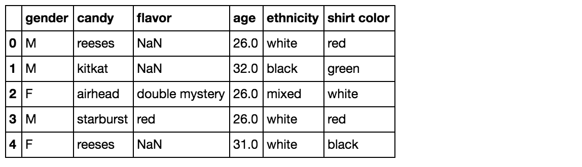
Looking at interselection time
plot_interselection_time_scaled(event_list, "red", "starburst")
plot_interselection_time_scaled(event_list, "orange", "airhead")
Higher values mean more time has passed before someone selected it, suggesting less popularity.
Airheads seem to be more popular than starbursts.
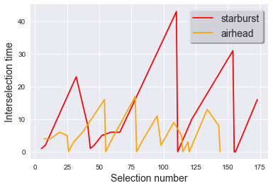
plot_interselection_time_scaled(event_list, "blue", "reeses")
plot_interselection_time_scaled(event_list, "green", "rolo")
And reeses seem to be more popular (have lower interselection times) than rolos.
Moreover, reeses starts off with low interselection time but jumps up a bit at the end, while the trend with rolo is reversed.
There is probably some interaction between the brands.
As the more popular one (reeses) gets to be depleted, the interselection time for rolo goes down.
Let’s predict interselection time
In other words, given a candy what is the interselection time?
Given that there might be interactions between the brands, a feature we should look at is:
- The presence of other brands (measured by interselection time of other candies)
In other words, if we build a predictor for the interselection time for starburst, we use the number of turns (the interselection times) for airheads, hersheys, reeses, kitkat, and rolos as features.
So imagine if starburst were the second most popular candy and airheads the most popular.
We can imagine interactions like the following: The interselection time for starburst goes down when the interselection time for airheads goes up (once airheads have run low). Similarly, when interselection times for the other candies are low, it means we are at a point where starburst has run low (since starburst is more popular than these other candies), so we would predict that the interselection time for starburst is high during those times.
A simple model
I’ll use something quick and simple for now- a regression estimator.
Prepare input data:
Each sharedStateEvent will be a map from all candy types to the time since that candy was selected:
shared_state_events = [{"airhead":0, "starburst":0, "hersheys":0,
                        "reeses":0, "kitkat":0, "rolo":0}]


i = 0
time_since_last = {}

for item in df["candy"].values:
    if not item in time_since_last:
        time_since_last[item] = 0

    event_list.append((i, item, time_since_last[item]))

    curr_shared_event = copy.deepcopy(shared_state_events[-1])
    curr_shared_event[item] = time_since_last[item]
    shared_state_events.append(curr_shared_event)

    time_since_last[item] = 0

    for e in time_since_last.keys():
        if e!=item:
            time_since_last[e]+=1

    i = i+1
events_frame = pd.DataFrame(shared_state_events)
random.seed(5656)

# Randomly select 30 events for our test set
test_indices = set(random.sample(range(events_frame.shape[0]), 30))

# Split data into training and test data
train_features = []
train_labels = []
test_features = []
test_labels = []

i = 0
for airhead, hersheys, kitkat, reeses, rolo, starburst in events_frame.values:
    if i in test_indices:
        # Use starburst as our label, and all others as our features
        test_features.append([airhead, hersheys, kitkat, reeses, rolo])
        test_labels.append(starburst)
    else:
        train_features.append([airhead, hersheys, kitkat, reeses, rolo])
        train_labels.append(starburst)

    i += 1
Train linear regression model
model = LinearRegression()
model.fit(train_features, train_labels)
LinearRegression(copy_X=True, fit_intercept=True, n_jobs=1, normalize=False)
Features that had the most influence on our model:
list(zip(events_frame.columns, model.coef_))
[('airhead', 0.27917574643921622),
 ('hersheys', 0.067093148933344948),
 ('kitkat', 0.23934536323789043),
 ('reeses', -0.014166149813878157),
 ('rolo', 0.13528711850951039)]
Evaluation
# Print mean squared error and R^2 on the test set
print('MSE:',np.mean((model.predict(test_features) - test_labels) ** 2))
print('R^2:',model.score(test_features, test_labels))
MSE: 19.5789288047
R^2: 0.0841933410829
Visualize performance of the model
# Plot predicted and true interselection times on the training set

plt.plot(train_labels, color="green", label="True value")
plt.plot(model.predict(train_features), label="Predicted value")

plt.xlabel("Selection number", fontsize=14)
plt.ylabel("Interselection time", fontsize=14)
plt.legend(frameon=True, shadow=True, framealpha=0.7, loc=0, prop={"size": 14})
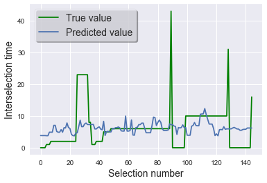
The blue is the predicted- it’s highly wiggly, which suggest that the model is overfitting.
# Plot with the test set

plt.plot(test_labels, color="green", label="True value")
plt.plot(model.predict(test_features), label="Predicted value")

plt.xlabel("Selection number", fontsize=14)
plt.ylabel("Time since selection", fontsize=14)
plt.legend(frameon=True, shadow=True, framealpha=0.7, loc=0, prop={"size": 14})
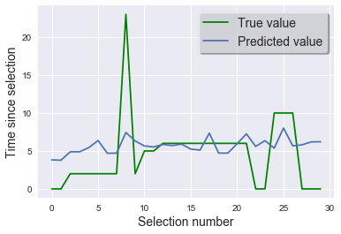
This is just our baseline model and we can certainly try to improve upon it; we can try adding some of the other features, try different models and do a GridSearchCV to find the optimal hyerparameters.
We could try other models but…
We might find that trying to get a point estimator is too high a level of precision for the data that we have.
Recast the problem?
Instead maybe we could approach this in another way- for example conduct a hypothesis test for interselection times between candies to give us some degree of confidence that they are not of the same popularity.
To be continued!